Just one of the notebooks, aka what I did in classes :)
Data used in the code section below can be downloaded here.
Reading netCDF files
import math
import numpy as np
import matplotlib as mpl
import matplotlib.pyplot as plt
import warnings
import pandas as pd
import netCDF4 as nc
from netCDF4 import Dataset
# open a netcdf file
file='sst.mnmean.nc'
fh = Dataset(file, 'r') # Dataset is the class behavior to open the netCDF file

# fh means the file handle of the open netCDF file
# print fh format
print(fh.file_format)

# # print info about dimensions
print(fh.dimensions.keys())
print(fh.dimensions['time'])

# print info about variables
print(fh.variables.keys())

# print attributes
print(fh.Conventions)

for attr in fh.ncattrs():
    print(attr, '=',getattr(fh,attr))

# Extract fh from NetCDF file
lats = fh.variables['lat'][:] # extract/copy the fh
lons = fh.variables['lon'][:]
time = fh.variables['time'][:]
d_times=nc.num2date(fh.variables['time'][:],fh.variables['time'].units)
sst = fh.variables['sst'][:] # shape is time, lat, lon as shown above
sst_units=fh.variables['sst'].units

d_times=nc.num2date(fh.variables['time'][:],fh.variables['time'].units)

# Calulate NINO index, & plot the results
latidx_nino3 = (lats >=-5. ) & (lats <=5. )
lonidx_nino3 = (lons >=210. ) & (lons <=270. )
latidx_nino34 = (lats >=-5. ) & (lats <=5. )
lonidx_nino34 = (lons >=190. ) & (lons <=240. )
sst_3 = sst [:, latidx_nino3][..., lonidx_nino3]
sst_34 = sst [:, latidx_nino34][..., lonidx_nino34]
NETCDF3_CLASSIC
dict_keys(['lat', 'lon', 'time', 'nbnds'])
<class 'netCDF4._netCDF4.Dimension'> (unlimited): name = 'time', size = 494
dict_keys(['lat', 'lon', 'sst', 'time', 'time_bnds'])
CF-1.0
title = NOAA Optimum Interpolation (OI) SST V2
Conventions = CF-1.0
history = Wed Apr 6 13:47:45 2005: ncks -d time,0,278 SAVEs/sst.mnmean.nc sst.mnmean.nc
Created 10/2002 by RHS
comments = Data described in Reynolds, R.W., N.A. Rayner, T.M.
Smith, D.C. Stokes, and W. Wang, 2002: An Improved In Situ and Satellite
SST Analysis for Climate, J. Climate
platform = Model
source = NCEP Climate Modeling Branch
institution = National Centers for Environmental Prediction
References = https://www.psl.noaa.gov/data/gridded/data.noaa.oisst.v2.html
dataset_title = NOAA Optimum Interpolation (OI) SST V2
source_url = http://www.emc.ncep.noaa.gov/research/cmb/sst_analysis/
Some further analysis and generated a plot to visualize the Sea Surface Temperature Anomalies (SSTA) over the Nino3 and Nino3.4 regions:
from datetime import datetime
times = []
for i in d_times:
    d = str(i.year) + '/' + str(i.month) + '/' + str(i.day)
    i = datetime.strptime(d,'%Y/%m/%d')
    # print(i)
    times.append(i)
#to get the mean values over lon/lat axis
nino3= np.mean(sst_3,axis=(1,2))-np.mean(sst_3)
nino34= np.mean(sst_34,axis=(1,2))-np.mean(sst_34)
plt.figure(1,figsize=(12,6))
plt.plot(times,nino3, color = "goldenrod", linewidth = 2, label = "Nin$o 3")
plt.plot(times,nino34, color = "maroon", linewidth = 3, label = "Nino 3.4")
plt.xlabel('Year')
plt.ylabel('Sea Surface Temperature Anomaly (oC)')
plt.legend(loc='upper left', prop = {'size':10})
plt.title('SSTA over Nino3 and Nino3.4')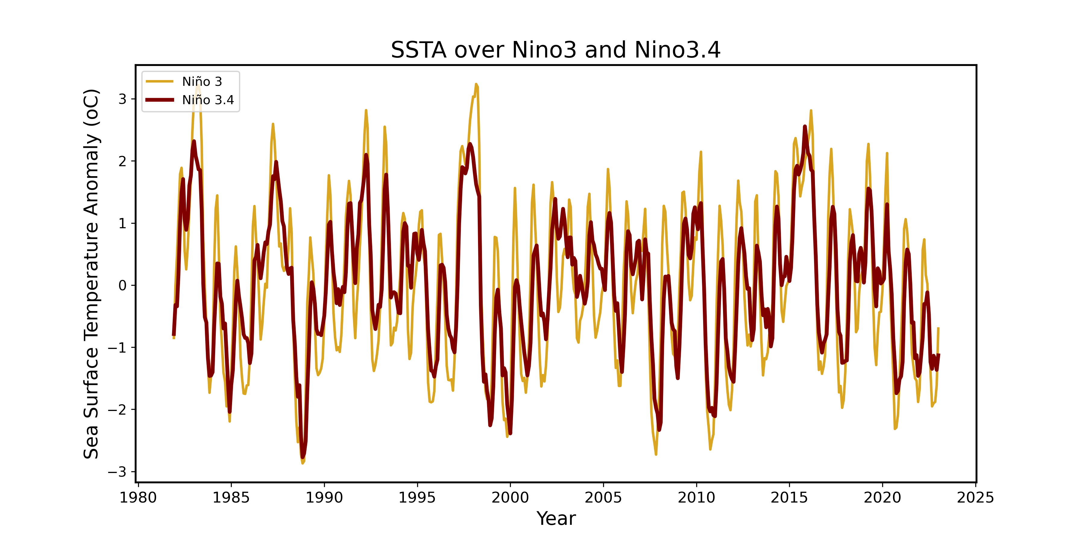
Nino 3 Region, which sits between 5°S and 5°N latitude and 210° to 270° longitude, is in the central and eastern equatorial Pacific. It’s a hotspot for dramatic temperature changes linked to ENSO. When El Niño kicks in, this area sees intense warming, and during La Niña, it cools significantly. That’s because it’s right in the thick of large-scale ocean-atmosphere interactions that drive ENSO’s strongest effects.
On the other hand, Nino 3.4 Region, which covers 5°S to 5°N latitude and 190° to 240° longitude, sits slightly farther east but still overlaps with the central Pacific. It straddles the boundary where warm waters from El Niño start to fade and where the eastern Pacific’s cooler upwelling processes begin.
The big reason Nino 3 experiences more extreme fluctuations than Nino 3.4 is because Nino 3 sits in a region where ENSO-related heat exchanges between the ocean and atmosphere are stronger, creating higher temperature anomalies. Meanwhile, Nino 3.4, positioned closer to the eastern Pacific, has a shallower thermocline, meaning warm surface waters don’t mix as deeply with the colder layers below.
Plotting average SST over the oceans
sst_avg = np.mean(sst,axis=0)

# land-sea mask
mask = Dataset('lsmask.nc', 'r').variables['mask'][:]
mask = mask.astype(float)
mask[mask == 0] = np.nan
#Let mask be the land-sea mask, we need to let the zero values be np.nan .

lon_2d, lat_2d = np.meshgrid(lons,lats)
fig = plt.figure(figsize=(20,8))
# Create a contour plot
plt.contourf(lon_2d, lat_2d, sst_avg*mask[0],levels=24,linewidths = 1, vmin = sst_avg.min(),vmax=sst_avg.max(), cmap = 'RdYlBu_r')

# Add colorbar and labels
plt.colorbar(label='Sea Surface Temperature (degC)')
plt.xlabel('Longitude')
plt.ylabel('Latitude')
plt.title('Average Sea Surface Temperature',fontsize=24)
plt.gca().set_facecolor("silver")
plt.savefig('08_average_SST.png',dpi=300)
plt.show()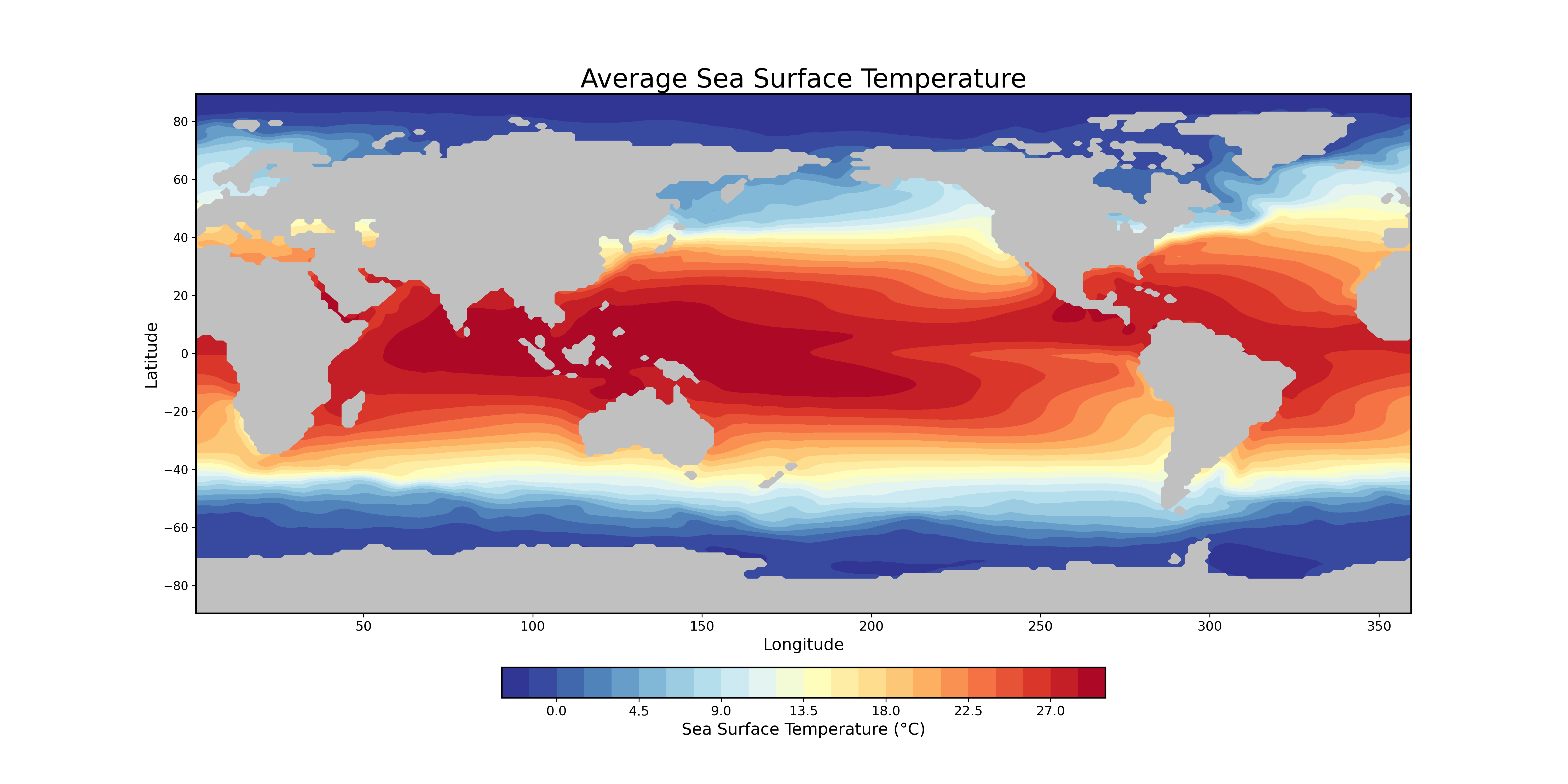
In the tropics, especially in places like the equatorial Pacific, the Sun’s rays hit more directly, delivering a concentrated dose of energy. This means the ocean absorbs more heat, keeping SSTs warm year-round. But up near the poles, the Sun’s rays strike at a lower angle, spreading out that energy over a larger area. That, combined with long, dark winters, results in much lower radiative heating, hence, colder ocean temperatures.
Plotting SST departures
I performed the following operations to calculate and visualize the departure of local Sea Surface Temperature (SST) from the zonal average field.
# Compute the zonal average SST
sst_zonal_avg = np.mean(sst, axis=2)

# Expand the zonal average array along the longitude axis to match the original SST shape
sst_zonal_avg_expanded = np.expand_dims(sst_zonal_avg, axis=2)
sst_zonal_avg_expanded = np.repeat(sst_zonal_avg_expanded, 360, axis=2)

# Calculate the departure of the local SST from the zonal average field
sst_departure = sst - sst_zonal_avg_expanded

# Calculate the mean of departure
sst_departure_avg = np.mean(sst_departure,axis=0)

cm = plt.cm.get_cmap('RdYlBu_r')
fig = plt.figure(figsize=(20,8))
# Create a contour plot
plt.contourf(lon_2d, lat_2d, (sst_departure_avg)*mask[0],levels=24,linewidths = 1,vmin=sst_departure_avg.min()+3,vmax=sst_departure_avg.max()-1, cmap = cm)

# Add colorbar and labels
plt.colorbar(label='Departure of local SST from zonal average field (degC)')
plt.xlabel('Longitude')
plt.ylabel('Latitude')
plt.title('Sea Surface Temperature Departure',fontsize=24)
plt.gca().set_facecolor("darkgrey")
plt.savefig('08_SST_departure.png',dpi=300)
plt.show()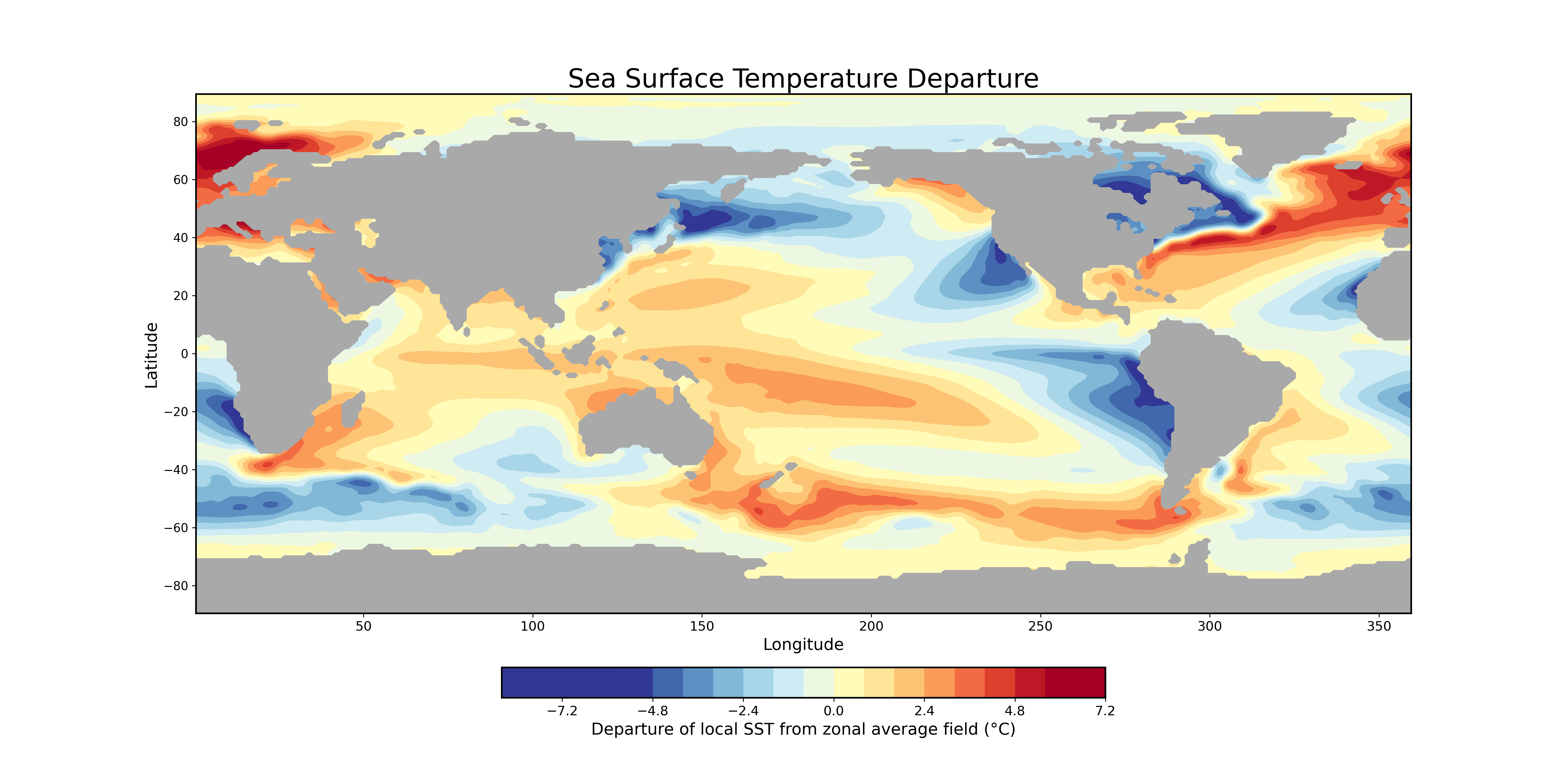
SST departure is just a fancy way of saying how much the local sea surface temperature (SST) differs from the average temperature across a given latitude. These deviations are shaped by a mix of atmospheric and oceanic circulations that move heat around in complex ways.
In the subtropics, the eastern parts of ocean basins tend to be cooler. That’s because air flowing along the eastern edges of high-pressure systems (anticyclones) moves toward the equator, bringing cooler temperatures along with it. This cooling effect is especially noticeable in the eastern Pacific. On the flip side, the western edges of these high-pressure systems push warm, moist air toward the poles, leading to warmer SST departures in the western Pacific.
Up in the higher latitudes, things get chillier due to sub-polar cyclones. These weather systems create a poleward flow of cool air, reinforcing lower SST departures in these regions.
Meanwhile, along the equator, there’s another big player: wind-driven upwelling. The trade winds sweep warm surface waters away from the equator, allowing deeper, colder, nutrient-rich water to rise up and replace it. This process is why the equatorial eastern Pacific and Atlantic tend to have lower SST departures.